Quoteden: Moving to Kohana 3
This post is written in collaboration with Marius Craciunoiu, my brother, and designer of Quote Den and other sites.
Hooray! 2 weeks after it started, Quote Den's migration from Drupal 6 to Kohana 3 is complete. This post offers a summary of that process, and lists some of the design improvements and implementation accomplishments. Along the way, it links to some of the resources used.
Table of contents:
Why change?
First of all, why the change? The reason for the change is threefold.
- Redesign opportunity - First of all, Quote Den needed a redesign. Almost every part of the site was going to be affected. This was a great opportunity to move on to a better platform.
- Ease of development - The (H)MVC model is a pleasure to work with, and once you get it, it's clear where your code goes, when you want to do something. While Drupal uses a similar model (module is similar to controller, template is similar to view), it is not exactly a breeze to develop in, and having worked with several, drupal sites, must say Kohana is much nicer.
- Flexibility - Using custom built models in a framework allows for more flexibility and ultimately control over the application. Basically, you can make it do what you want without having to hack it.
- Performance - Kohana is a fairly simple framework. Compared to Zend, for example, it offers fewer features and is perfect for a simpler website such as Quote Den. We didn't need all of the features that Drupal offers either. Finally, Kohana works quite a bit faster than Drupal for Quote Den's purposes. As a comparison, the new site now loads in ~0.5s versus ~0.75s on my computer (over an average of 20 page loads). Here is a YSlow comparison of new versus old. Content caching is not yet in place.
Redesign details
In terms of design, the old site suffered quite a bit. Some of the pre-launch issues include:
- lacking a clear and consistent navigation
- inconsistent design across the website
- inconsistent spacing and centering of elements
- search pages were not very useful
- individual quote pages were almost empty (now they list related quotes)
- there was no link to the landing page (besides the logo)
- Drupal and the quotes module did not offer good administrative options
- the site had no contact link
The rest of this section summarizes some of the improvements in more detail.
Search engine
The older search was the default Drupal search, presumably using MySQL fulltext search. The new implementation uses Sphinx search, which does stemming, and searches for other inflections of the same word. For example, searching for "hopeless" includes results with "hopelessness", or searching for "loving" includes results with "love". The new search is also much faster, at least in part because it does not need to query the database. You can read more about Sphinx search here. It is worth noting that Drupal could also be configured with Sphinx.
Navigation
When we first designed the website, we wanted it to be as simple as possible. This meant stripping it down of all features except the basics: a page to list quotes and a search function. Later on, this became a problem because we added other features, such as the Top Rated page and categories for each quote. We wanted to add a Top Rated link to the header, but there wasn't a good place for it. If it were placed next to the search bar, it seemed to be the label for the input box, but if it were placed too far away, it looked alienated.

This issue was solved with the introduction of the tabbed navigation menu. The Top Rated tab is now located next to the "Newest" tab. The menu also solved another issue: the user can now see which page they are located on because the active tab changes color.

Categories
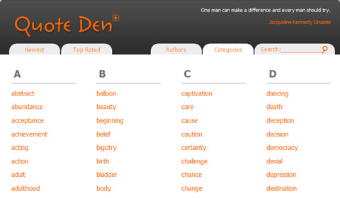
Another feature introduced after the initial launch of the website was the addition of categories. In the old design, they were placed at the top of the quote, which caused the quote itself to receive less attention. To fix this, the new design shows the categories under the quote and reduces the font size.

When categories were first added, there wasn't a page to list them all. They offered the benefit of seeing quotes in the same category, and were also included in search. Now, we have a Categories page.
Polishing the design
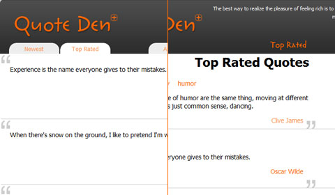
One of the issues with the old Quote Den was an inconsistent design. For example, the heading "Top Rated Quotes" did not match the general style of the website. To solve this, we removed page headings altogether. The active page is now shown by the navigation menu.
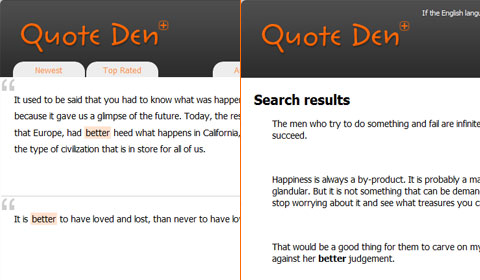
The search page looked completely different than the rest of the website. Users could click anywhere on the quote to go to the individual quote, although there was no distinction made to indicate this. The quote ID and rating were missing from the results, which diminishes their value across the website and possibly discourages users from rating. If no one would see the rating while searching, then what's the point of rating? The search page is now styled just like the other pages. In terms of usability, we made it easier for users to find what they're looking for. If users see a quote they like in the search results, they can vote on it right away.
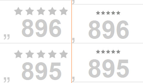
Part of perfecting the design was to balance all the elements on the page. The first and foremost stage in this process was to make sure all the elements are equally apart from their surrounding elements. For example, the ID and Rating were closer to the bottom of the quote than the top. Second, the stars were too small to balance the visual weight of the ID. To solve these problems, we enlarged the stars and centered them with the quote area.
Administrative Options
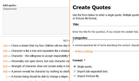
Although probably none of you may see this anytime soon, one of the reasons we redesigned Quote Den was because it was a pain to add quotes. The add form was incredibly complex. To give you an idea of how BIG this thing was, you should know it had:
| Before | and | After |
|---|---|---|
|
vs |
|
Feedback
Of course no website would be complete without the almighty contact us link, so we added one on the bottom. We hope our viewers will contact us about anything related to the website, whether that is feedback on the site or suggestions on the quotes themselves.
Implementation process
We actually started with Kohana 2, unsure about how easy it will be to migrate. A major concern was how quickly we could get Quote Den up and running on the new platform. Following tutorials (mostly, a blog tutorial), getting a simple quote+author page going was quick and painless, so we decided to go ahead and use Kohana.
As soon as the quote and author models were finalized and tested to work, a quick attempt at a migration was necessary. This turned out to be quick and easy.
Next, we had templates. Using Kohana's Controller_Template, set up Controller_Quote. Then wrote a quotes template (under views/quotes/quotes.php, extending views/base/template.php).
Afterwards, we added minify, categories, author pages. Since quotes use categories everywhere they are displayed, a good option was to overwrote the quote model constructor to always grab the related categories, sorted.
<?php
class Model_Quote extends ORM {
  // ...
  public function __construct($id = NULL) {
    parent::__construct($id);
    $this->_object['categories_list'] = $this->categories
         ->order_by('name', 'asc')
         ->find_all();
  }
}
Then pagination. There is a simple pagination module documented on the unofficial wiki which works beautifully.
On to search. We decided on using Sphinx, since Paul is already familiar with it from SUMO and knew how to set it up. Sphinx has many advantages - it scales, it's fast, it's powerful and customizable. There is a bit of a learning curve to it, but you can mostly learn by examples. Paul started with SUMO's sphinx.conf and drastically simplified it, then modified it to match my database structure. Finally, set up a crontab on my VPS to reindex and rotate every 24 hours.
The final crucial aspect was having a way to add and edit content. This required user authentication -- which, fortunately, comes with Kohana 3 and works well. We just use the default auth module and we haven't had any problems. Here's a code sample:
<?php
// application/classes/controller/user.php
  public function action_login() {
    // ...
    // if posted data
    if ($_POST) {
    $user = ORM::factory('user');

    // check auth
    if ($user->login($_POST)) {
      // redirect to my account
    } else {
      $view->errors = $_POST->errors('login');
      $this->template->title = 'Error logging in';
      return ;
    }
  }
}
After this, all that was left was the rating system. After some searching for good ways to do it using only CSS, we found a great one here, and then went on to write a model/controller for it. Rating only works through javascript at the moment, but that will change once we implement a mobile-friendly version.
Setting up an RSS feed took Paul literally 20 minutes, and then the final page left to write was the Top Rated page.
To top it off, we have also put in place a bunch of .htaccess RewriteRules for handling redirects from old Drupal URLs.
Conclusion
So that's it. The Quote Den Drupal->Kohana work summarized. The benefits: performance improvements of more than 50% (in page load time), more flexibility, consistency in the design, and Sphinx search.
And if you're learning Kohana, and would like some help, shoot us a comment below.